Google Fonts Alternatives for Kinfolk Serif Font in 2026: 9 Fonts Compared
By ToolNimba Editorial Team November 8, 2026 10 min read

- Top pick
 Playfair Display
Bold editorial headlines
Starting priceFreeCheck out Playfair DisplayRead our review - Runner-up
 Cormorant Garamond
Elegant, light headlines
Starting priceFreeCheck out Cormorant GaramondRead our review - Also great
 Libre Baskerville
Warm book-style body text
Starting priceFreeCheck out Libre BaskervilleRead our review
How we researched this
We compared official pricing and feature pages, app store listings, privacy policies and public user reviews. Prices change, so check the provider's site before you pay.
Key takeaways
- All nine fonts below are free and open source on Google Fonts, so you can use them on a website, in print, or in a client project without a font license fee.
- Cormorant Garamond and Playfair Display come closest to a high-contrast, magazine headline look, while Lora, Merriweather, and Source Serif 4 hold up better in long body text.
- EB Garamond is the closest free match for a classic Garamond feel, and Libre Baskerville gives a similar bookish warmth with a larger x-height for screens.
- Pair a display serif with a plain sans serif for body text or captions, and keep delicate weights at larger sizes so thin strokes stay readable.
- Check the license on the Google Fonts page for the exact family you download, since a few families carry different terms for modified versions.
Quick comparison
| Name | Best for | Starting price | Free plan | |
|---|---|---|---|---|
| Playfair Display | Bold editorial headlines | Free | Yes | Visit |
| Cormorant Garamond | Elegant, light headlines | Free | Yes | Visit |
| Libre Baskerville | Warm book-style body text | Free | Yes | Visit |
 Lora | Literary articles and blogs | Free | Yes | Visit |
 EB Garamond | Classic Garamond feel | Free | Yes | Visit |
 Merriweather | Screen-friendly body text | Free | Yes | Visit |
 Crimson Pro | Long-form reading | Free | Yes | Visit |
 Source Serif 4 | Flexible text and display sizes | Free | Yes | Visit |
 Fraunces | Expressive modern editorial work | Free | Yes | Visit |
The best Google Fonts alternatives for Kinfolk serif font
Kinfolk magazine is known for a calm, spare, editorial look: generous white space, quiet photography, and serif type that feels literary rather than loud. The fonts below capture parts of that feeling, and all of them are available free from Google Fonts.

Playfair Display is our pick for most people who want a headline that reads as editorial at a glance. Its thick and thin strokes give it a classic, print-magazine presence, and the contrast is what makes a cover line or a section heading feel considered rather than plain. It has a broad range of weights, so you can set a light, airy headline or a heavier standfirst without switching families.
The honest catch is that Playfair Display is a display face first. At body size, the high contrast can make long paragraphs harder to read, especially on lower-resolution screens. Use it for headings, pull quotes, and short introductions, and pair it with a calm sans serif or a sturdier serif for the main text. That split keeps the Kinfolk-style calm while protecting readability.
- Strong high-contrast headlines
- Wide weight range
- Works well at large sizes
- Thin strokes can tire readers in long passages
- Needs care at small sizes
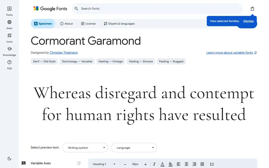
Cormorant Garamond is the closest of this group to a refined, gallery-like headline. Its letterforms are light and graceful, with sharp serifs and long, delicate lines that suit fashion, food, travel, and lifestyle pages. If your project leans toward the softer, more romantic side of the Kinfolk look, this is the family to try first.
The trade-off is legibility at small sizes. Light weights can look faint on some screens, so keep Cormorant Garamond for headings, captions set larger than usual, and print work where the detail can be seen. For body copy, pair it with a plain sans serif so the page stays easy to scan. Used that way, it gives a page a quiet, high-end feel without shouting.
- Graceful, refined letterforms
- Lovely italics
- Free for commercial use
- Very light at small sizes
- Needs larger sizes to show its detail
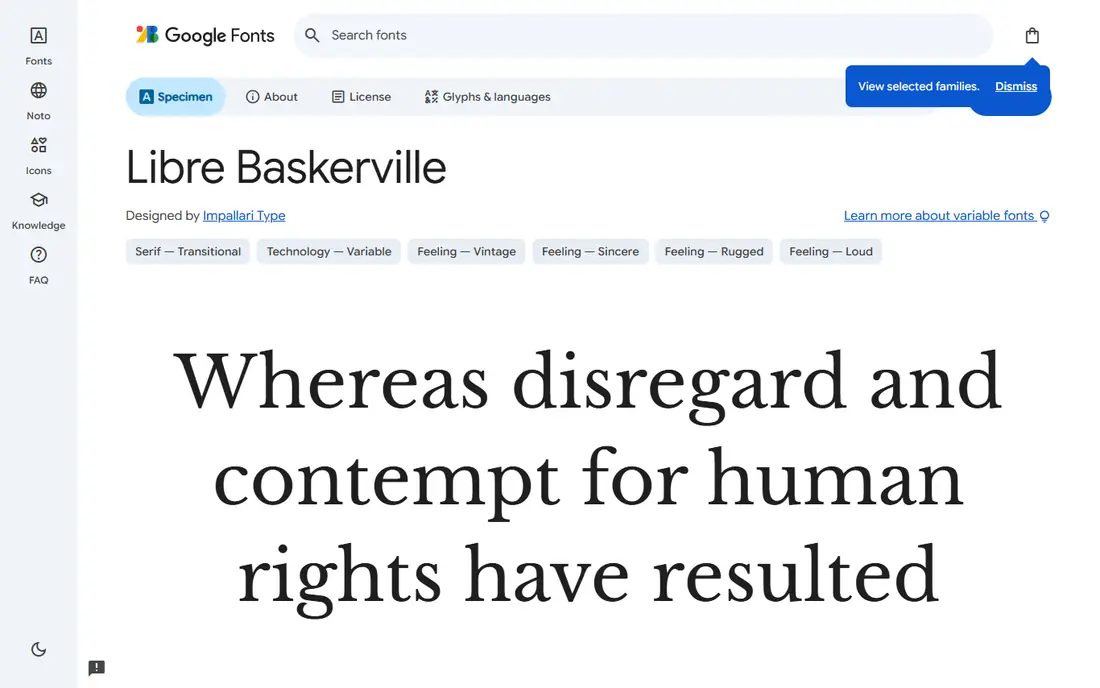
Libre Baskerville brings a bookish warmth that suits the slower, reading-first mood of Kinfolk-style publishing. It is based on the Baskerville tradition, with a larger x-height that helps it stay readable on screens, and it works well for articles, essays, and newsletters. If you want one serif to carry most of a page, this is a sensible, low-risk choice.
It is less striking as a display face than Playfair Display or Cormorant Garamond, and its weight range is narrower. That is not a flaw for body text, but it means you may still want a separate headline font if you want real contrast on a cover or a landing page. Pair Libre Baskerville with a simple sans serif for labels and navigation, and let the serif do the reading work.
- Readable at body sizes
- Warm, bookish tone
- Good for long articles
- Fewer weights than some rivals
- Less dramatic as a headline face
Lora has a literary, slightly calligraphic character that makes long articles feel inviting rather than formal. Its curves are softer than a strict Garamond revival, which helps it suit personal essays, food writing, travel stories, and independent magazines. The italics are especially pleasant, which matters for pull quotes, captions, and cited phrases.
Lora is less suited to pages that need a crisp, corporate voice, and it can look soft when set very small. Keep it at comfortable body sizes, give paragraphs room to breathe, and avoid cramming it into dense sidebars. For a blog or a small magazine site, Lora is one of the easiest ways to get a warm editorial tone without paying for a commercial family.
- Warm, calligraphic feel
- Strong for articles
- Good italics
- Can feel soft for hard news or technical pages
- Less sharp at tiny sizes
EB Garamond is the pick if you want the classic Garamond character itself: old-style proportions, a calm rhythm, and a sense of print history. It is a revival of Claude Garamond's sixteenth-century work, adapted for modern screens, and it reads as scholarly and understated rather than fashionable. For books, journals, and long-form essays, that restraint is a strength.
On screens, EB Garamond can look lighter than Lora or Merriweather, so test it at your actual body size before committing. It also benefits from generous line spacing and a slightly larger size than you might use for a sans serif. If you like the Kinfolk mood but want something closer to a traditional book face, EB Garamond is the most direct free option here.
- Faithful to the Garamond tradition
- Elegant at text sizes
- Wide optical range
- Can look light on some screens
- Older revival feel may suit print more than apps
Merriweather was designed with screen reading in mind, and that shows in its sturdy strokes and large x-height. It stays clear at small sizes, in long articles, and on devices where a delicate serif would fade. If your site will be read mostly on phones, or if your readers include people who read at smaller sizes, Merriweather is the practical choice in this list.
The trade-off is character. Merriweather feels more workmanlike than Cormorant Garamond or EB Garamond, and it will not give a page the same airy, gallery feel on its own. Use it for body text and pair it with Playfair Display or Cormorant Garamond for headings. That combination gives you the editorial look up top and a dependable reading experience below it.
- Designed for screens
- Sturdy strokes
- Very readable in long text
- Less elegant than Garamond revivals
- Heavier feel in headlines
Crimson Pro is a text serif built for long-form reading, with balanced proportions and a calm, even texture on the page. It suits novels, essays, reports, and magazine features where the reader should notice the words, not the typeface. It also handles italics and small caps style settings well enough for structured documents.
Crimson Pro will not carry a cover on its own. Its personality is quiet, which is a virtue in body text and a limit in display use. If you want a Kinfolk-style page, use Crimson Pro for the article itself and choose a more expressive headline face from this list. The result is a page that feels considered without asking the body font to do display work it was not made for.
- Comfortable for extended reading
- Balanced proportions
- Good for books and essays
- Quieter personality than display serifs
- Limited drama for covers
Source Serif 4 is the most flexible family here, with optical sizes tuned for small text and for larger display use. That makes it a good fit for sites that mix articles, product pages, and documentation, since one family can stay consistent across sizes without looking strained. Its tone is clean and neutral, which suits publishers who want readability first and a distinct voice second.
Neutrality is also its limit. Source Serif 4 does not by itself create the soft, romantic mood that Cormorant Garamond gives, so pair it with careful photography, spacing, and a headline treatment that carries the mood. If you run a publication with varied content types, that flexibility is worth more than a single dramatic headline face.
- Optical sizes for text and display
- Clean and adaptable
- Strong for mixed content
- More neutral than romantic serifs
- Needs pairing for a distinct magazine voice
Fraunces is a modern variable serif with a distinctive, slightly old-style character that can feel both warm and current. Its variable weights and optical sizes let you tune a headline from soft to punchy, which is handy for a modern editorial site that wants personality without a commercial license. It works well for food, design, and culture publications that sit close to the Kinfolk world but want a fresher edge.
Because Fraunces has a strong character, it can dominate a page if used everywhere. Use it for headings and short display text, and let a quieter serif or sans serif carry long passages. With that restraint, Fraunces gives a project a memorable voice while keeping the calm, spacious feel that defines the style you are aiming for.
- Variable weights and optical sizes
- Distinctive yet readable
- Good for modern magazines
- Strong character can dominate a page
- Needs restraint in body text
How we picked these
We compared official Google Fonts pages, family descriptions, and license notes for serif families that share the Kinfolk mood: quiet, literary, and print-like rather than bold or decorative. We favored families that are free and open source, that work at real web sizes, and that cover both headline and body roles. We did not claim hands-on print testing, and we checked that each family is listed on Google Fonts before including it.
How to match the Kinfolk look without copying it
Start with the role, not the font name. Choose one face for headlines, one for body text, and one plain sans serif for labels, captions, and navigation. Set body text larger than you think you need, give paragraphs generous line spacing, and leave white space around images. Test delicate weights on a phone in daylight, since a weight that looks fine on a large monitor can fade on a small screen.
For print, test EB Garamond, Libre Baskerville, or Crimson Pro for the main text, and use Playfair Display or Cormorant Garamond sparingly for titles. For the web, load only the weights you use, since loading every weight slows a page for little benefit. Finally, keep your pairing to two or three families. More than that, and a quiet page starts to look busy, which is the opposite of the calm editorial feel you want.
Sources
- https://fonts.google.com
- https://fonts.google.com/specimen/Playfair+Display
- https://fonts.google.com/specimen/Cormorant+Garamond
- https://fonts.google.com/specimen/Libre+Baskerville
- https://fonts.google.com/specimen/Lora
- https://fonts.google.com/specimen/EB+Garamond
- https://fonts.google.com/specimen/Merriweather
- https://fonts.google.com/specimen/Crimson+Pro
- https://fonts.google.com/specimen/Source+Serif+4
- https://fonts.google.com/specimen/Fraunces
Frequently asked questions
What is the closest free Google Font to the Kinfolk serif style?
There is no single official match, since Kinfolk's look comes from layout, photography, and spacing as much as from one typeface. For headlines, Cormorant Garamond and Playfair Display come closest to the refined editorial feel. For body text, Lora, Libre Baskerville, and EB Garamond give a similar quiet, literary tone.
Are Google Fonts free for commercial use?
Google Fonts are open source, and most families use the SIL Open Font License or the Apache License, which allow commercial use. Always check the license shown on the specific family page before you use a font in a paid product, since terms can differ for modified versions.
Which Google serif font is best for body text on a website?
Merriweather and Source Serif 4 are the most dependable for screen body text, because they were tuned for readability at smaller sizes. Lora and Libre Baskerville are warmer choices for blogs and magazines, provided you set them at a comfortable size with good line spacing.
Can I use these fonts in print as well as on the web?
Yes. You can download the families from Google Fonts and install them for print work, or load them on a website through the Google Fonts service. For print, test the exact weights you plan to use, since light display weights that look fine on screen can print thinner than expected.
How do I pair a serif headline font with body text?
Use contrast, not similarity. Pair a high-contrast headline serif with a sturdier serif or a plain sans serif for body text, and keep the total to two or three families. Set headlines larger, keep body text at a readable size, and use the sans serif only for labels, captions, and navigation.